
Brand Strategy & Identity · Spain & Portugal
Dental Medical Group was formed by bringing together top-tier dental professionals across Spain and Portugal — over 50 highly qualified specialists, a multidisciplinary team covering all areas of dental medicine, state-of-the-art technology, and a shared vision of excellence.
The challenge was to build a brand capable of representing one of the most ambitious dental groups in Europe: unifying multiple clinics under a single identity that could position the group as a leader in quality, innovation, and patient experience.
The dental industry has long relied on cold, clinical, emotionally distant branding. We set out to challenge that. The brief required moving from clinical to human — replacing distance with proximity, and balancing institutional trust with genuine emotional connection.
The angular chevron form in the logo embodies forward momentum — a visual metaphor for progress, precision, and the group’s direction of travel. Bold, modern, and unmistakably distinctive in its category.

The logo construction grid reveals the precision behind the mark. The chevron angle, letterform proportions, and spacing relationships are all derived from a single geometric unit — ensuring perfect reproduction at any scale.

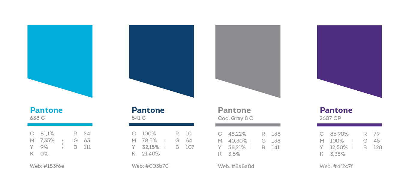
Four colors working in concert — the primary pair establishes authority and energy, while the secondary palette adds depth and flexibility across all brand applications.
Consistent and intentional use of type is essential for establishing professional brand recognition. The Intro family was chosen for its geometric clarity, rounded warmth, and range across all brand contexts.
From digital platforms to physical applications, the identity system maintains consistency and impact at every scale — from screen to street.


Every strong brand starts with a clear conversation. Book a free 30-minute discovery call — no pitch, no pressure.