
Food Brand · Berlin · Venezuela
Kärrecho was conceived as a cultural mirror of Venezuela — past, present, and future. Not leaning into clichés, but reflecting a more complete and nuanced identity: a country shaped by creativity, resilience, and optimism. The same Venezuela that contributed to the idea of freedom in the Americas and produced influential artists like Carlos Cruz-Diez.
Beyond achievements, Kärrecho is rooted in something deeply human: the warmth of its people. Venezuelans are known for their openness, hospitality, and their natural inclination to make others feel at home. Kärrecho aimed to translate that feeling into a physical space — a place where both Venezuelans and Germans could connect, share, and feel welcome.
Born from a simple observation: Berlin's culinary scene lacked Venezuelan representation. In a city known for its diversity, Venezuelan street food was virtually absent. This gap presented a clear opportunity — to introduce a cuisine defined by bold flavours, vibrant ingredients, and a strong sense of identity.
The name emerged from the need to connect two audiences — German and Venezuelan — through a shared emotional meaning that feels native to both.
The concept reinterprets a familiar Venezuelan expression — "¡Qué arrecho!" — commonly used to describe something impressive or exciting. A phrase alive with energy and emotion.
Through phonetic and visual transformation, the expression was adapted to resonate within a German context — preserving its original emotional meaning while feeling instantly familiar to a new audience.
The use of ä reflects German pronunciation of the ae sound — a subtle but powerful linguistic bridge that signals cultural fluency without forcing anything.
Replacing Q with K reinforces familiarity for a German-speaking audience. A single letter change that makes the word feel native, not foreign.
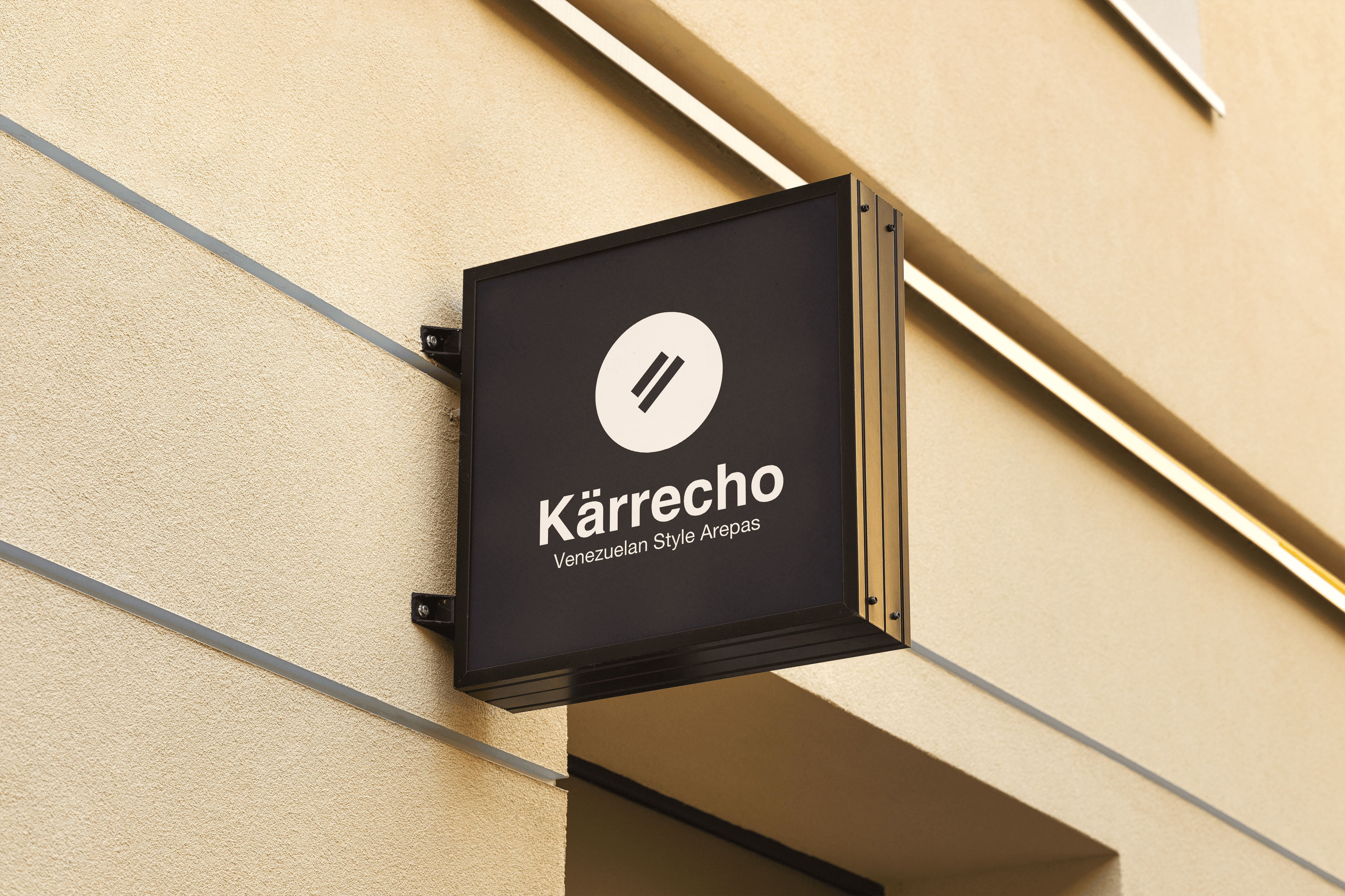
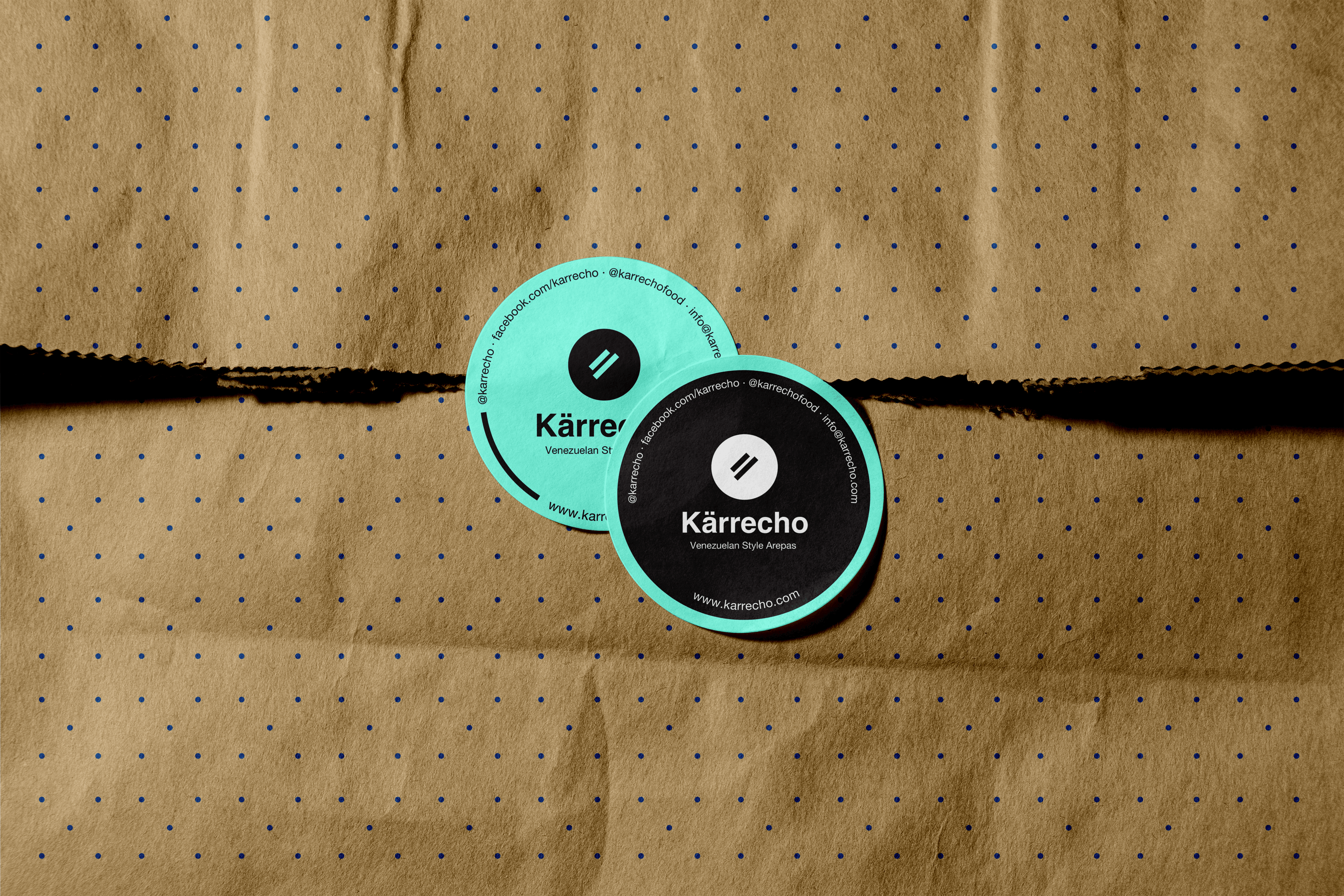
The double-line symbol — two parallel strokes inside a circle — is instantly graphic and culturally flexible. Minimal enough to work anywhere. Distinctive enough to own.
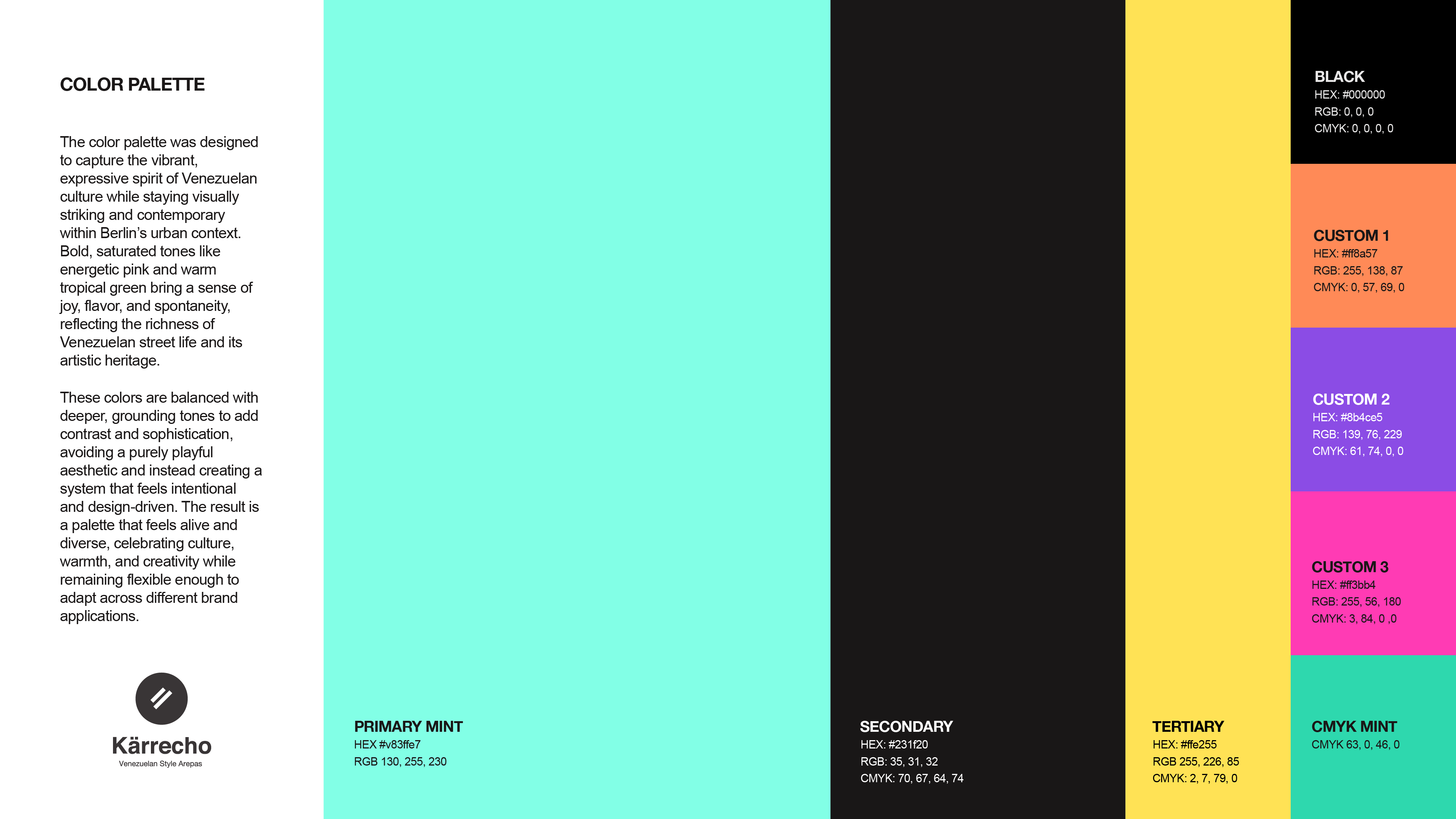
The palette was designed to capture the vibrant spirit of Venezuelan culture while staying visually striking within Berlin's urban context. Bold saturated tones balanced with grounding darks.
Two typefaces working in tension — the neutrality of Helvetica Neue anchors the brand while Mix Kitsch, a hand-crafted script, brings the warmth and spontaneity of Venezuelan character.

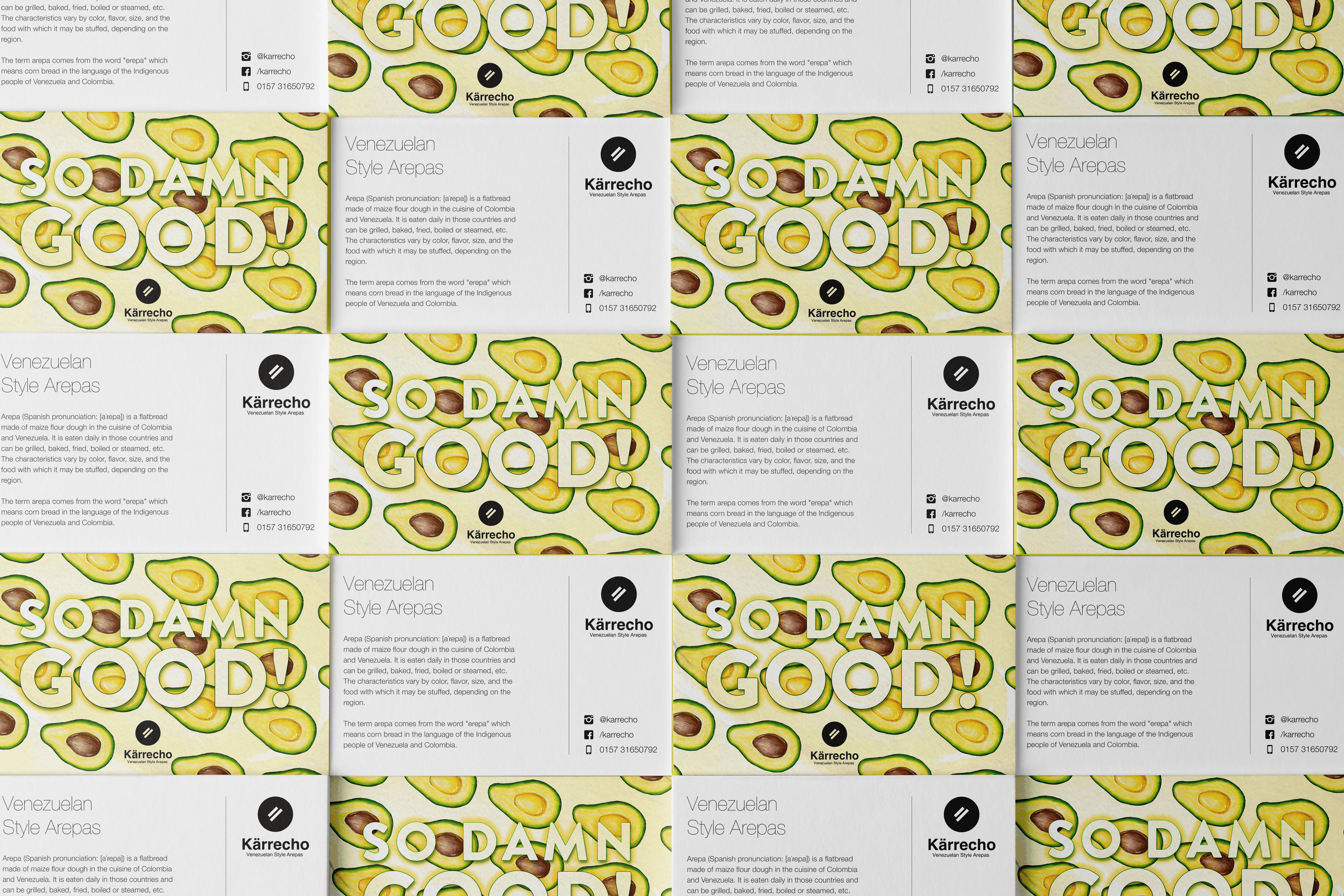
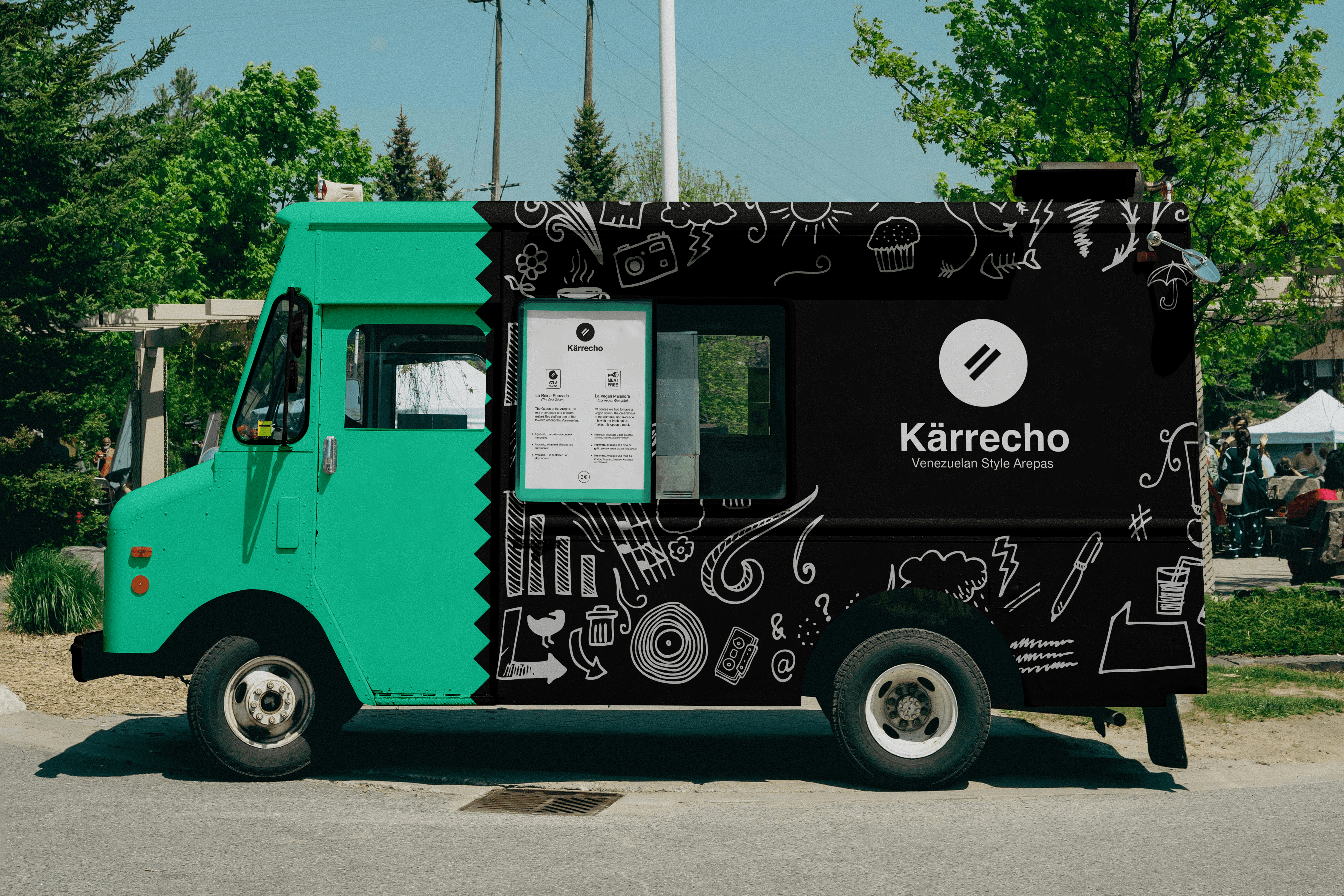
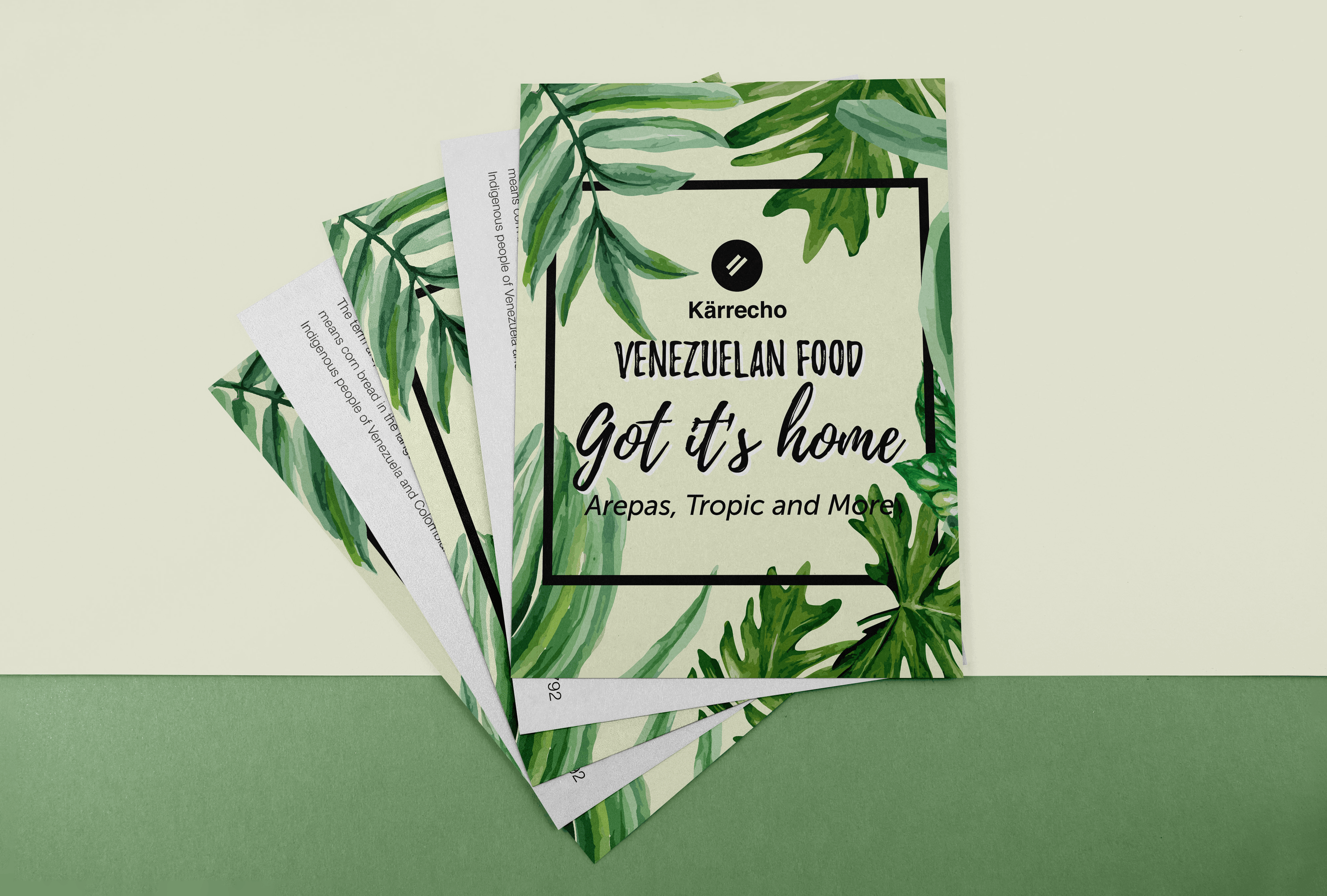
From street food signage to printed collateral and stickers — the Kärrecho identity is built to live in the city, on the street, and in people's hands.


Every strong brand starts with a clear conversation. Book a free 30-minute discovery call — no pitch, no pressure.