Brand Discovery
Loveo brand in use
Brand Identity & Strategy

Óptica
Loveo

Client Óptica Loveo
Location Asturias, Spain
Scope Full Brand Identity
Deliverables Logo · Type · Color · Guidelines

A brand built to own its field.

Prestige Youth Strength Modernity Innovation

Óptica Loveo needed more than a facelift — they needed an identity that could carry genuine ambition. Operating in Asturias, Spain, they came to us with a clear goal: establish a new image that positions them as a modern, forward-thinking optic in a competitive market.

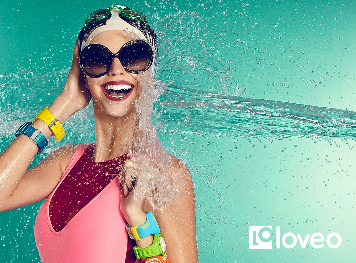
The challenge was to capture something rare: the intersection of clinical precision and approachable warmth. A brand that feels premium without feeling cold. Fresh without being trendy. Built to last, and built to own.

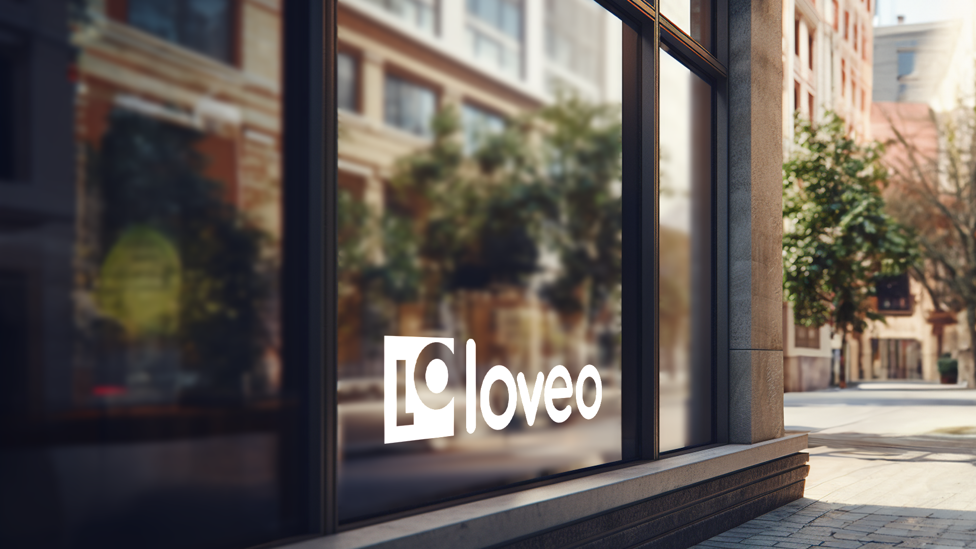
Our approach was a fresh trademark with a modern, geometric typeface — paired with a color system that communicates both trust and energy.

Loveo primary logo
01 — Logo System

One mark. Many contexts.

Each variant adapts to a specific surface and context — without ever losing its core geometry or brand recognition.

Loveo primary logo
Primary — Full Color
Loveo short logo
Short — Reduced Lockup
Loveo fancy variant
Fancy — Formal
Loveo casual variant
Casual — Dynamic
Loveo social variant
Social — Digital
System philosophy

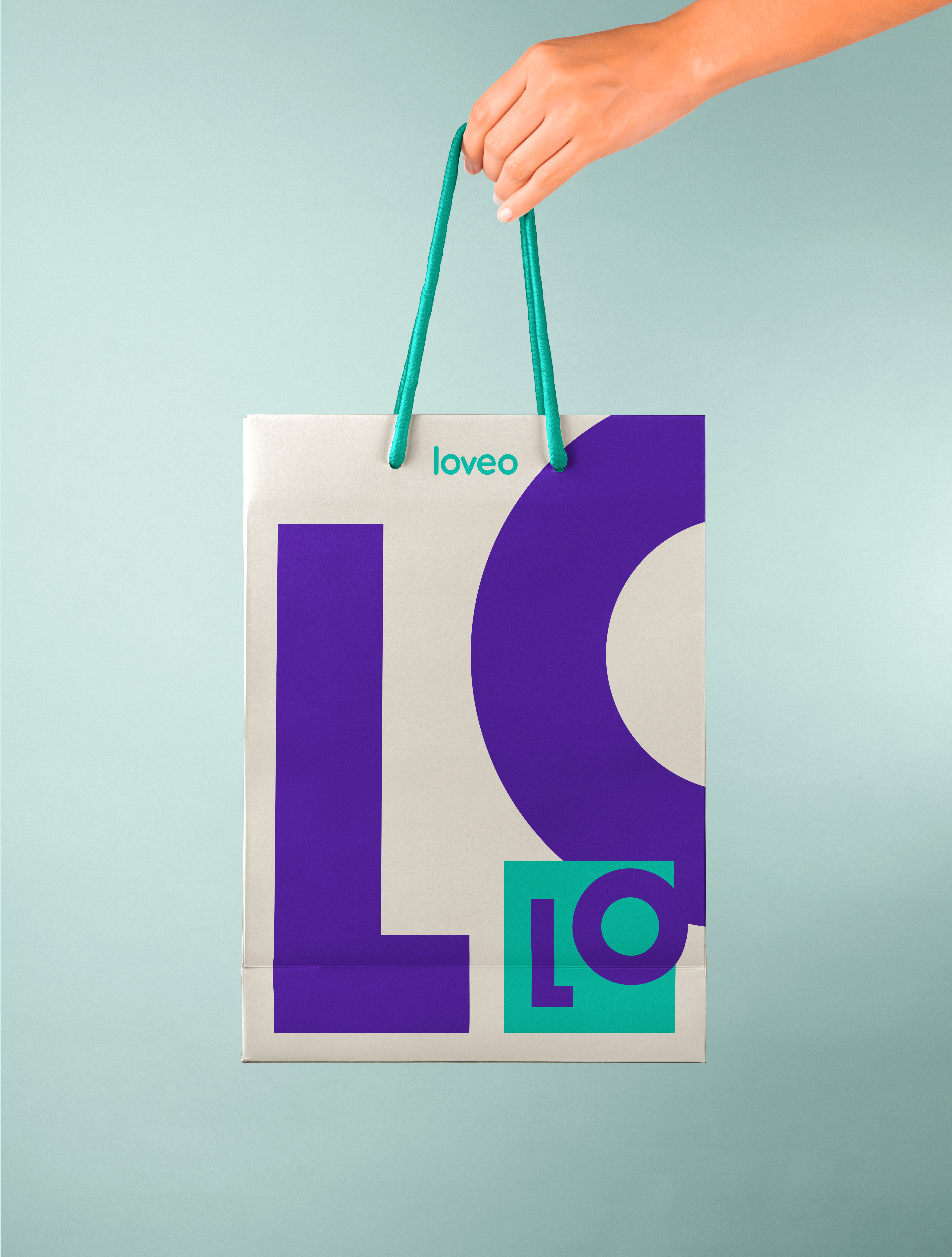
The LO monogram is the heart of the system. From the structured formality of Fancy to the energetic tilt of Casual — five expressions, one unmistakable identity.

02 — Construction

Construida sobre una cuadrícula.
Diseñada con intención.

Every element of the Loveo mark follows precise geometric rules. The LO container, the circular counter, the 45° diagonal cut — nothing is arbitrary. The construction grid ensures perfect reproduction at any scale.

Loveo brand construction grid
Geometric
Pure forms. Every curve and angle derived from the same modular unit.
Modern
Clean and contemporary — free of unnecessary ornamentation.
Optical
The circular O references the lens — a direct nod to the brand's field.
Scalable
Performs from a 16px favicon to a 3-metre shopfront sign.
Versatile
Five distinct variants covering every surface — digital, print, ambient.
03 — Type & Color

Las formas tipográficas
and the palette.

Quicksand was chosen for its geometric, rounded character — clean, youthful, and balanced. The color system gives the brand both warmth and authority.

Loveo typeface Quicksand Loveo color palette
Verde Azulado Primario
#1aba8e
Pantone P 154-8 C
Morado Secundario
#5b3fa0
Pantone P 96-8 C
Carbón Neutro
#3c3240
Pantone Black 5 C
5
Logo variants across all use contexts
3
Core brand colors with Pantone specification
1
Cohesive identity system from scratch
Scalable from favicon to shopfront signage
Loveo brand on MacBook
Brand in context
Let's work together

Ready to build a brand
worth remembering?

Every strong brand starts with a clear conversation. Book a free 30-minute discovery call — no pitch, no pressure.